More on Brand Elements
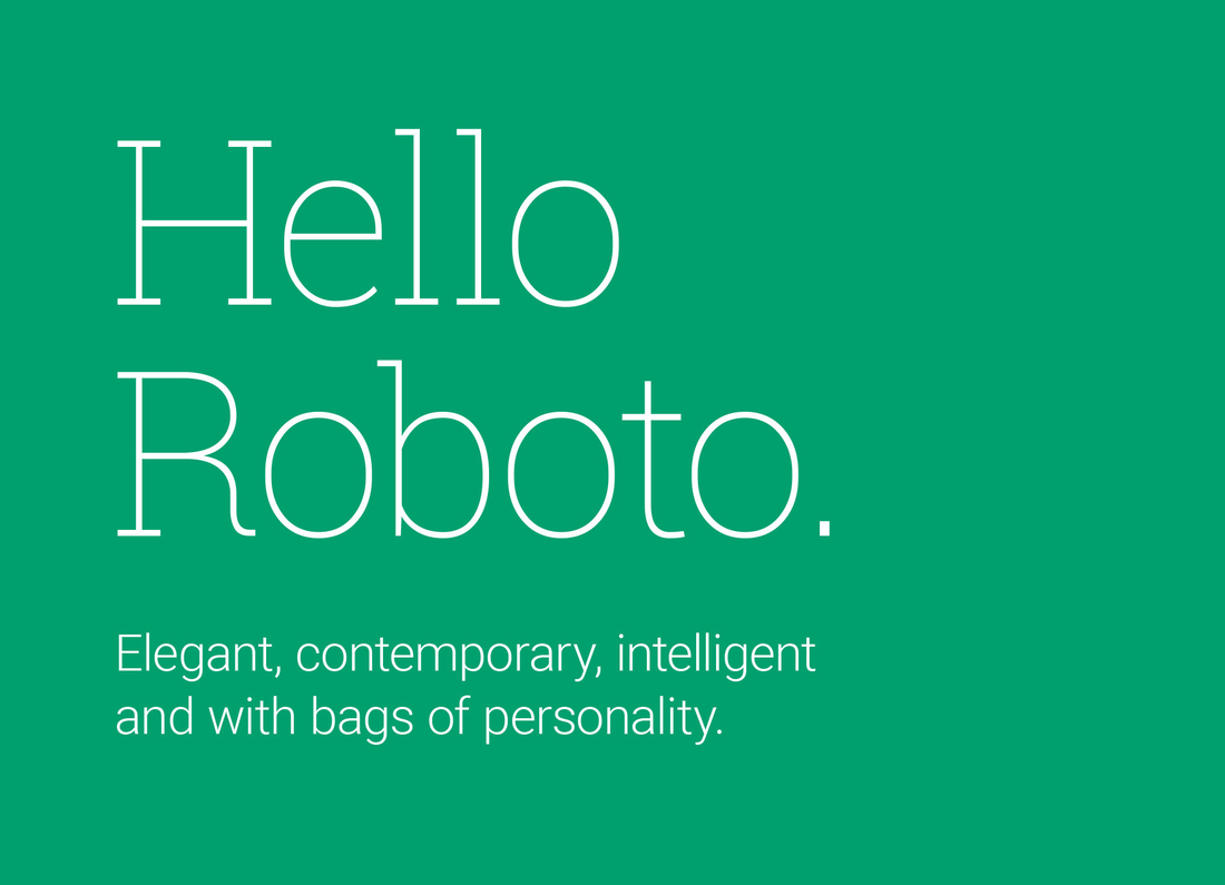
Primary Typeface: Roboto
Roboto is INSEAD’s primary typeface. Versatile and contemporary, it offers both slab and sans serif styles across a wide range of weights, allowing flexibility across print and digital applications.
Selected as an evolution from our previous typeface, Rockwell, Roboto retains a sense of familiarity while bringing a more modern, accessible feel. Its geometric structure and open curves strike a balance between precision and warmth—conveying clarity, approachability and academic rigour.
As part of our visual identity, Roboto supports clear communication across diverse platforms, reflecting the global, human-centric values of the INSEAD brand.
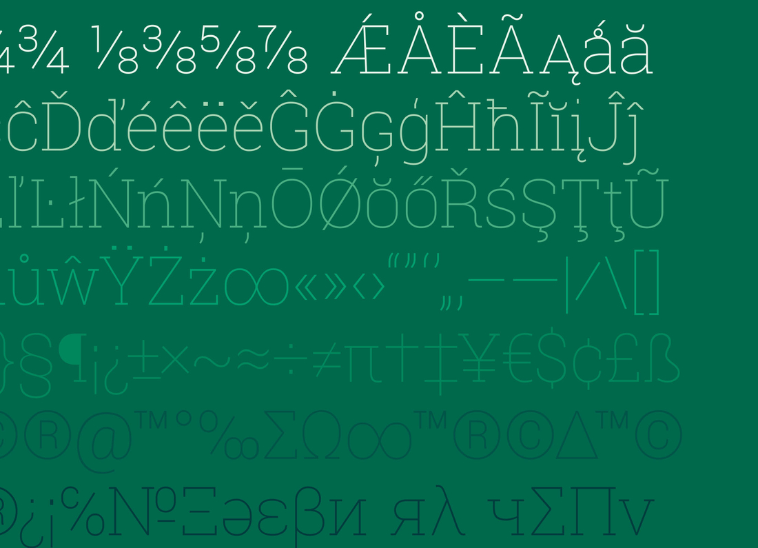
Language Support
With cross-platform compatibility, non-Latin language support and worldwide access, Roboto makes a beautiful and confident statement when communicating the INSEAD brand. Roboto includes a large glyph family reflecting INSEAD’s global focus.
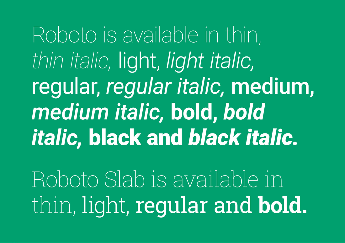
A Complete Family
There are a large number of font weights available within the Roboto typeface. This enables INSEAD to tailor its communication to its audience and message. However because of this flexibility, strict adherence to the visual style of INSEAD’s typography needs to be adhered to, to ensure brand consistency.
Using Roboto Effectively
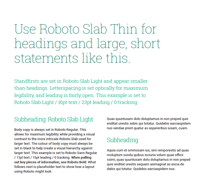
INSEAD’s typography plays both a functional and aesthetic role. It enables clear, consistent communication across a range of audiences, while visually expressing the diversity and sophistication of our global community through its range of weights, styles and applications. Colour and font variation help establish visual hierarchy and structure. Consistent use of Roboto and Roboto Slab reinforces this clarity and supports our broader brand principles.
Typography Guidelines
- Align both headings and body text to the left for visual consistency
- Use sentence case for all body text
- Keep layouts clean and uncluttered
- Ensure generous spacing between headings and content
- Avoid wide blocks of text – instead, use narrower columns to enhance readability
Download Roboto
Both Roboto and Roboto Slab are freely available for download here:
Supplementary Typefaces
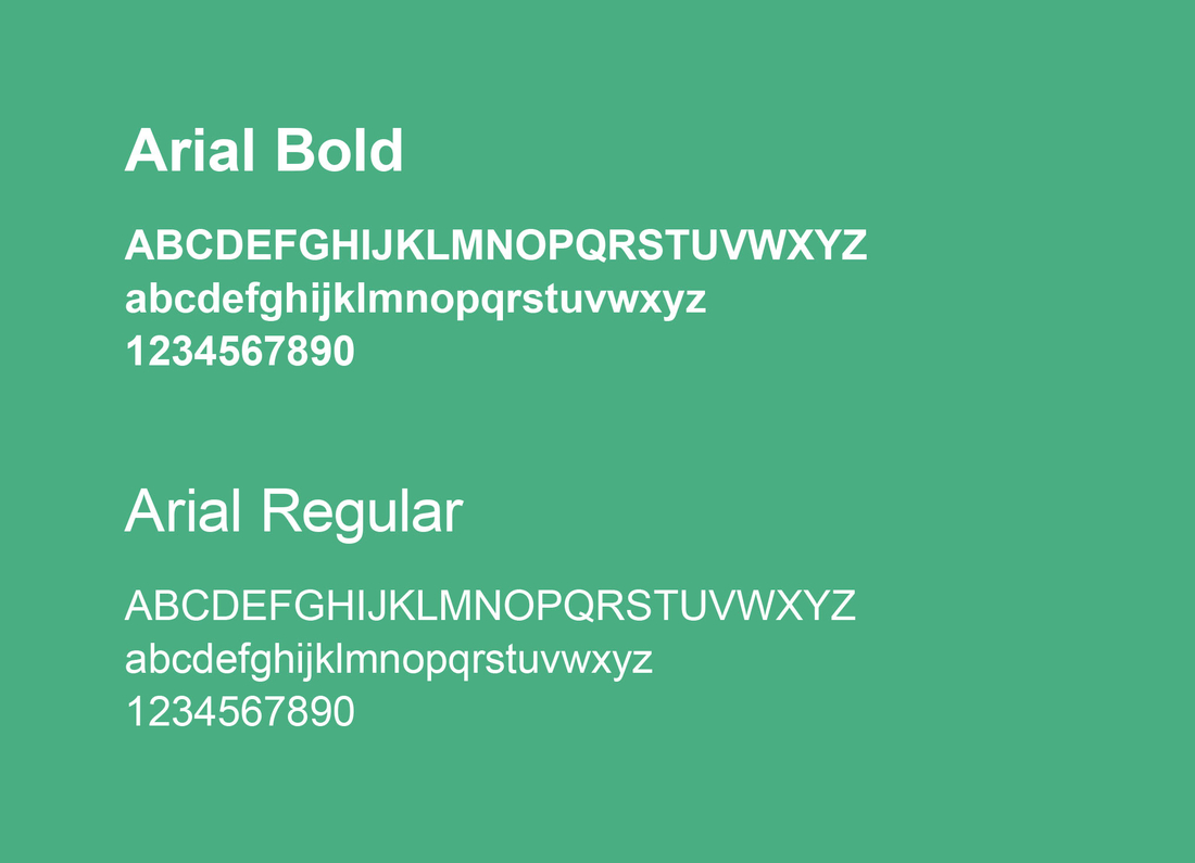
Arial
In cases where Roboto is unavailable, particularly in institutional contexts where system compatibility is a consideration, Arial should be used as the default alternative.
This includes applications such as PowerPoint presentations, formal letters and email signatures, where device consistency is essential.
To preserve visual coherence, Arial should never appear alongside Roboto or any other typeface within the same layout. The only exception is in newsletters, where banners or standfirsts may be set in Roboto. In such cases, ensure the overall hierarchy and styling remain consistent.
Noto
For content in Simplified Chinese or Japanese, please use:
- Noto Sans SC (Simplified Chinese) >
- Noto Sans JP (Japanese) >
Should INSEAD staff or faculty have any questions regarding the installation of Noto, please contact the INSEAD IT department.
Requesting the Use of Other Typefaces
While Roboto, Arial, and Noto are INSEAD’s approved fonts, we recognise there are specific branding cases such as event identities, campaigns, or partnerships where the use of alternative typefaces may be appropriate.
In such instances, prior consultation with the INSEAD Brand and Communications team is required to ensure the selected typeface aligns with our brand values and maintains visual coherence across applications.
Please contact the Communications team before proceeding with any non-standard font choices.