Colour Guidelines
More on Brand Elements
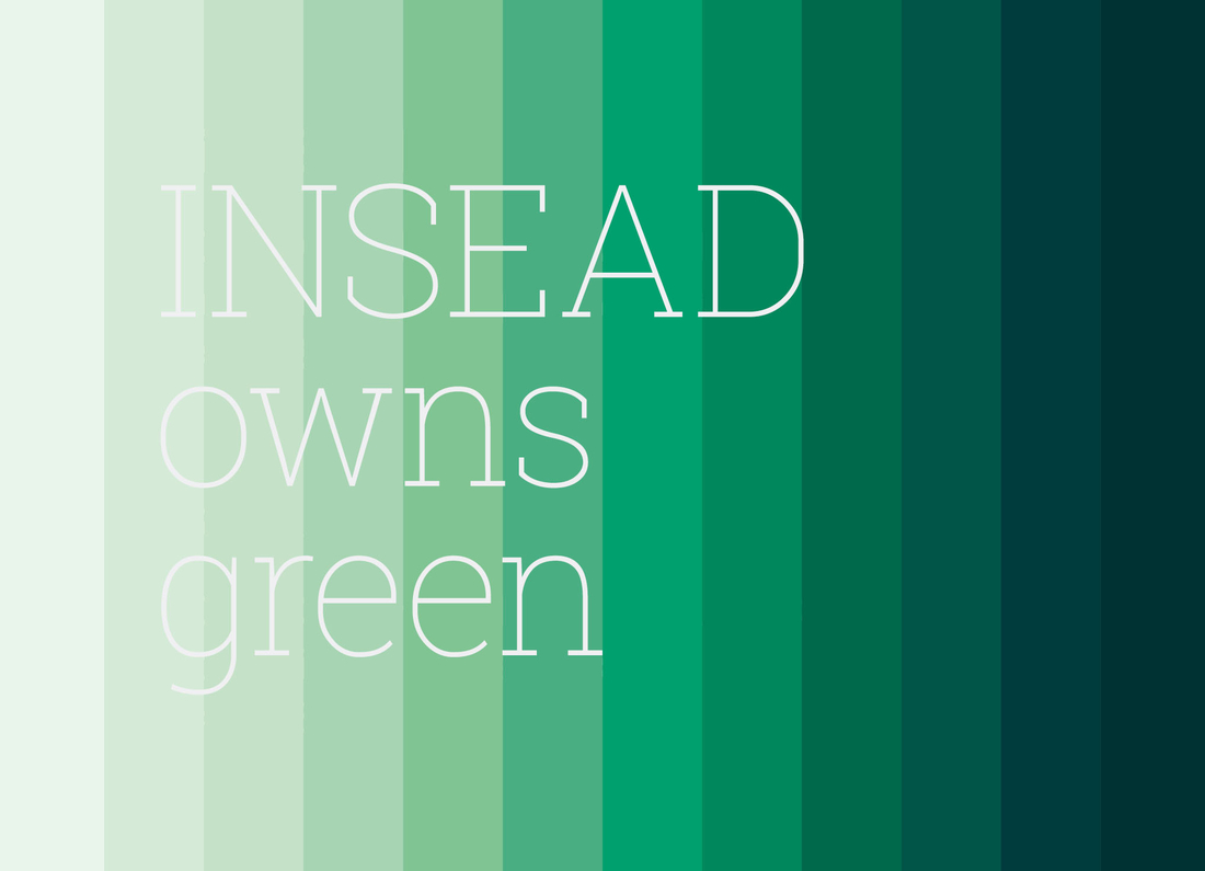
INSEAD owns Green
Green sits at the heart of INSEAD’s identity. More than just a colour, it carries meaning deeply rooted in the school’s history. Our primary green was inspired by the forest of Fontainebleau, where INSEAD first took shape in 1957. This connection to nature reflects the spirit of growth, renewal and possibility that has defined our community ever since.
To strengthen this connection and help INSEAD stand apart, we have developed a complete palette of greens. This extended range allows us to express the brand with flexibility and distinction, while firmly claiming green as a defining element of who we are.
Green speaks of openness, progress, and transformation—qualities that reflect our mission as The Business School for the World. Whether in print or digital, our colour palette brings consistency, energy and recognition to everything we create.
Primary Green
INSEAD’s primary green, September, is to be used as the primary colour across all applications and communications.
The first ever MBA class at INSEAD took place in September 1959. Our primary green is named in celebration of this month.
Black and white are used extensively in communications alongside green, so, therefore, form part of the primary palette.
Secondary Palette
Greens
Alongside the primary INSEAD green (September), there are also 11 other greens in the secondary palette. Together, these 12 greens represent the months of the year – delineating a journey of transformation and change.
When using the green palette, be mindful of the audience you are communicating with: the darker greens are more suitable for premium and more mature audiences; the lighter tones are more fresh and playful and can be directed at a more youthful audience. Digital applications emphasise the use of lighter tones from the palette, using darker tones sparingly.
Greys
An equally varied palette of complementary grey tones sits alongside INSEAD’s, providing muted tones to support and lift the greens.
Tertiary Palette
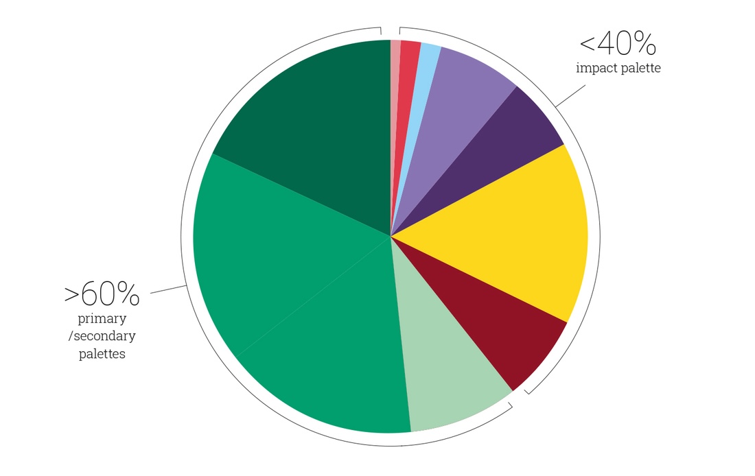
Impact Colours
While our primary and secondary palettes represent the months of the year, our impact palette is named after different cities from across the globe. These colours have been chosen to add impact and diversity to printed and digital collaterals. They should be viewed as supplementary to INSEAD’s green palette and never dominate. They should be used to add visual flair and interest. As a general guide, these colours should never cover more than 40% of the visual canvas.
As a general guide, these colours should never cover more than 40% of the visual canvas.