Brand Evolution
More on Brand Philosophy
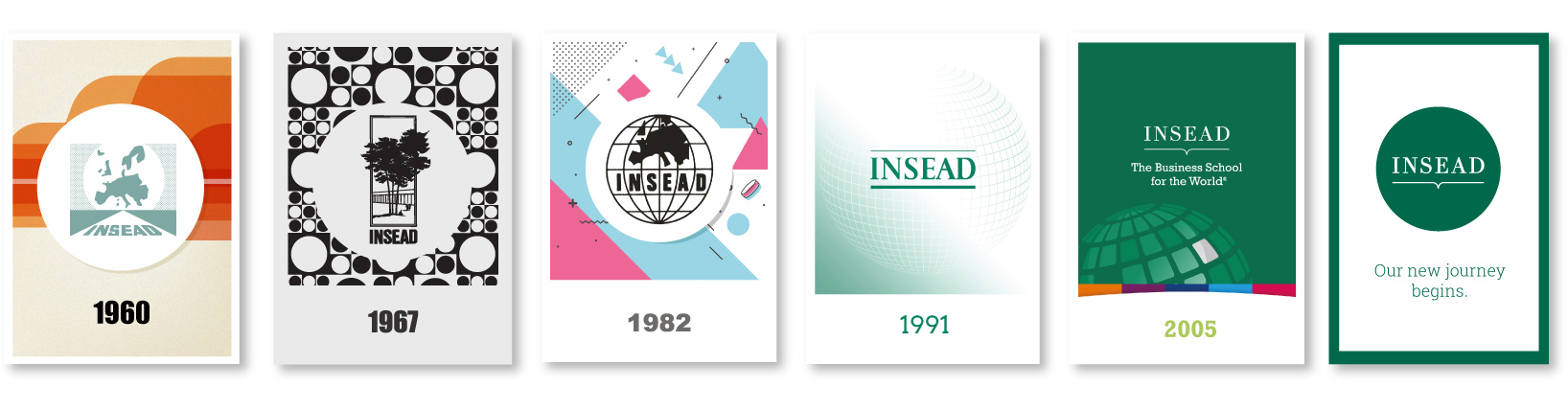
The INSEAD Brand Evolution
INSEAD’s brand has evolved over time to reflect the school’s growth, global reach and forward-looking vision. While staying true to our core values, the brand continues to adapt to a changing world.
New world hope
Established in the aftermath of the Second World War, our founding ambition was to promote reconciliation and renaissance in post-war Europe. Our name was originally the ‘Institut Européen d’Administration des Affaires’, but from the start, we used the acronym – now trademarked – in our logo, while depictions of the continent of Europe clearly showed where our interests lay.
Change for the world
To keep up with the aesthetics of the era and in response to our greater clarity of vision in a changing continent, we evolved our logo in the mid-‘60s. This saw us introduce a solid outline to the globe graphic, while adopting a more detailed depiction of Europe and a simpler, straighter approach to the type.
New roots, new campus
This logo coincided with the opening of the Europe Campus in Fontainebleau in 1967, where three Scots Pines had been planted in honour of our three founders. These new premises were revolutionary – state-of-the-art classrooms were considered the most advanced in Europe and the ‘ultra-modern atmosphere’ impressed all visitors.
A global focus
By the early ‘80s, we still saw ourselves as a European business school, but one of our main focuses was working out Europe’s position in an ever-shifting global economy. With more prominence given to the world, this version of our logo reflected the wider scope of our research and offering.
Green by nature
In 1991, we introduced green to our colour palette – inspired by the leaves of the forest of Fontainebleau – and introduced the classic serif font.
The Book of Knowledge
The strapline ‘The Business School for the World’ was introduced in 2005, as we made manifest our global outlook. At the same time, the ‘Book of Knowledge’ device was introduced, while the INSEAD wordmark font also evolved to a more elegant and confident slab serif.
Our new journey
Strong, confident and inclusive, our latest brand evolution introduces the roundel – representative of the world and of our global reach, standing and ambitions.
This bold evolution has enabled us to uncouple the logo and strapline.
We are now, quite simply, INSEAD.
Postcards Memorabilia
Download the logo evolution postcards from print (A6 format)