More on Brand Elements
Institutional Imagery
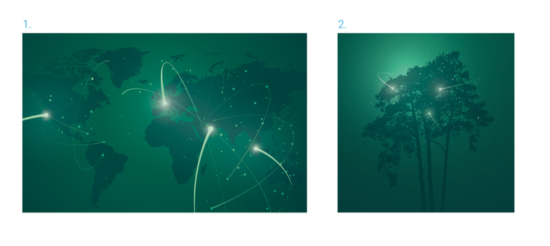
Light plays a central role in INSEAD’s institutional imagery. It is used not only as an aesthetic device, but as a way to convey ideas, energy and purpose through visual expression.
Our institutional graphics often feature rich, darker tones from the secondary green palette, punctuated by moments of bright light. This visual language reflects INSEAD’s global presence, its transformative impact, and its forward-looking mindset.
Some graphics may also incorporate abstract symbolism—such as growth, connection or balance—that nods to the school’s heritage, values, and founding vision. These visual elements help reinforce INSEAD’s identity while offering flexibility across a range of formal and institutional contexts.
Globe Graphic (1.)
This visual uses deeper shades from INSEAD’s secondary green palette, illuminated by dynamic bursts of light. It represents the school’s global reach, interconnectedness, and thought leadership across borders.
Tree Graphic (2.)
A symbolic illustration referencing INSEAD’s three founders, the Tree graphic reflects legacy, growth and rooted values. Ideal for communications tied to the school’s heritage and institutional narrative.
Flat Illustrations
Illustrations are used to clarify information whether to explain a fact or statistic, illustrate a broader concept, or support a key point.
They should be clear, purposeful, and easy to interpret at a glance. Simplicity in both style and concept ensures illustrations remain functional and accessible.
Where appropriate, illustrations should make full use of the secondary green colour palette, celebrating its diversity by incorporating a broad range of green tones. This helps maintain visual consistency while adding vibrancy to communications.

Iconography
Custom Icons
INSEAD’s custom icon set has been carefully designed to align with the brand’s visual identity. These icons should be used as provided and must not be altered in form, colour, or proportion.
All icons feature consistent keyline weights to ensure visual harmony. When scaling icons for different applications, keylines should not scale proportionally. As icons increase in size, the keyline thickness should be adjusted more subtly to preserve a refined, balanced appearance that complements surrounding text and graphics (see examples below for guidance).
If you require additional or bespoke icons, please contact the INSEAD Communications Department.
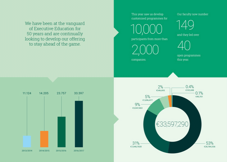
Infographics
Infographics should be clear, informative, and visually engaging. Like illustrations, they make use of INSEAD’s secondary colour palette ideally incorporating a broad range of green tones to create a sense of cohesion and brand continuity.
The impact palette may be used to draw attention to key data points or highlights, but should be applied sparingly typically occupying no more than half of the overall layout.
Simple geometric shapes can help unify diverse content elements, particularly in presentations and data-rich communications. This approach ensures clarity while maintaining a polished, professional look.